March 2021
Good code
Been thinking a lot about heuristics for judging code this month. (Been thinking a lot about it every month, actually; it's my job).
We do a lot of code review at Komodo, so I'm always trying to think of how to judge code without jumping immediately to how-would-I-have-done-it-ism.
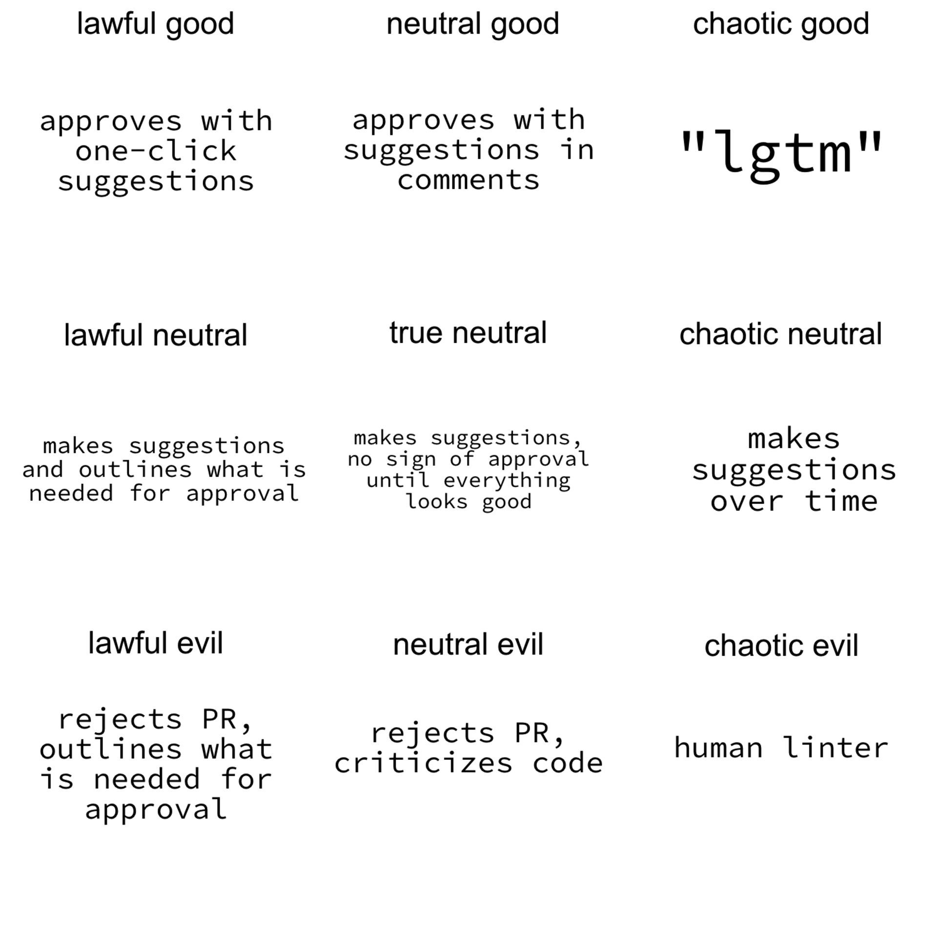
David Khourshid posted this meme earlier this year, back in January:

And ever since then I've been desperately trying to stay out of "human linter" territory. Though I worry that more often than not, I wind up more in the "lgtm" zone. I think I'd like to aim for "neutral good".
But so anyway, on the topic of not being a useless human linter, Shawn Wang posted Dan Abramov's "Optimized for change" on his blog recently and I think that ease of adaptation is a good benchmark for good code—and importantly, a benchmark that keeps me from writing PR review comments on the level of, "that's not properly indented".
(I know the Internet has had enough of pseudo-smart white guys kowtowing at the alter of Dan Abramov, and I get the sense that he's not too comfortable with it either. I don't really care one way or the other, but I liked the above post.)
Code is only written once but rewritten endlessly, so leaving code open to rewriting, to tweaking and modifying and copypasting, is all good design. Client needs change, specs morph, goalposts move, and the code that survives is the code that's open to modification. I love to tell the client that a fix is a one-liner.
Sort of feels congruent with the open/closed principle: that entities should be open to extension but closed to modification.
SOLID is nice, but don't get me started on Uncle Bob.
The Design of Forms
Old "guide to the design and simplification of forms is intended for use by civil servants" in the UK from the 1960s. I haven't spent a ton of time with it, but I've been browsing individual chapters every time I've got 15 minutes sat around.
This is obviously about the design of printed forms, but I think a lot of the dogma carries over into the digital world. A lot of people draw unnecessary lines between print and digital media a lot of the time, but guides like this are more about visual design (as opposed to print or digital), and make themselves useful across a broad swathe of disciplines.
It's pretty neat, too, how you can pretty easily trace the line from this document to the GOV.UK Design System in use in the UK today.
It's nice to live in a country that cares about details like this. The United States just leaves it up to the state, and the state leaves it up to the county, and turning human experience into state-managed data winds up a mishmash of confused citizens and weary public servants.
A designer is
I'm not a designer but I like to think that I have an eye for good design (or at least, some taste), and I really liked this definition of a designer's work, from Anton Sten:
"A designer is... someone who can help you solve problems in a way that you can't."
Add his blog to your RSS feed if you're into considered approaches to practical design.
r0ml
Speaking of quotes, I spotted Robert Lefkowitz on UsesThis this past month and I really like the way that he writes about what he does. He sounds very laid back, very done with what he's doing, as if he's accomplished all he's set out to do:
"One of my year round hobbies is writing code, which I was lucky enough to do professionally for so many years."
I hope that one day I can have that sort of relationship with my work. For the moment, however: work work work.
User-controller dark mode
I made the background on this website dark a couple years ago, probably around the time that I migrated it from a Rails application to a Next.js with markdown. I know that this presents some issues, since light-on-dark text can be difficult to read for certain people. Nevertheless, I like dark mode, and I'm probably the person who reads this blog most often, so I left it like that for a while.
This month, however, I followed a Piccalilli tutorial to add a dark/light mode toggle to the site.
The basic idea here is that I load the site with whatever your preferred colour scheme is, but offer a toggle that flips a CSS custom property on the <html> element. If you flip it, it saves your preference to localStorage and loads it up whenever you reload the page—so that if you come back, your preference is saved. Simple but effective.
Next
A bit of meta-commentary on Tailwind CSS' description: "Tailwind, like most CSS frameworks, solves a problem really well. Its supporters, on the other hand, are a pain.