Pointy Serif Fonts
I like to try and watch trends develop. I've always been immensely interested in trends.
While living in Japan, I tried to chart the progress of society's tastes in candies (being somewhat of a candy connoisseur), and found that the flavour du jour changed about every 5-7 months--from peach to kiwi to muscat grapes to coconut or blood orange. Never something so banal as strawberry. I guess that trend had already come and gone long before I did.
I don't think I'll ever really be able to see trends coming before they arrive. If I've ever found myself on the cresting wave of some piece of popular/aesthetic culture, it's always been 100% by chance.
But I think that I've done a good job of keeping my eyes open for trends just as they break into the popular purview. I find that I can, sort of passively, catalogue little incongruous pieces of culture that I've come across once or twice; and when I start to come back across them again and again, I get a little thrill of self-satisfaction. As if by taking note of something, I'm somehow better than it. As if I have some sort of culturo-aesthetic edge on it. As if I'm part of some vanguard.
I think I just know where to look. I'm subscribed to all of the real vanguard's email newsletters.
Anyway, I'm a little late on this, but the one I've been watching lately is the web design world slowly moving from the rabid worship of the font geometric, back round to the more quote-unquote humane look of serifs and faux-pencil marks that characterise modern web illustration.
But enough snark about drawings--it's the fonts I care about here.
I think we've all been a little high on the data-driven choices of nice geometric sans-serifs on the Internet for the past five or seven years. I say data-driven because some circa-2004 studies found that serifs are easier to read on screens, because of antialiasing or pixel density or some real OS/hardware-jockeyish-type stuff. Anyway we just all seemed to agree that sans-serifs were the Way To Go: culminating in Apple's screen-optimised San Fransisco (which, yeah no it's humanist and not geometric but stick with me) and Google's pivot from whatever serif they used to use, over to the totally inoffensive geometric logotype in use today.
But so after years of nice geometric fonts with big x-heights and friendly letterforms, designers everywhere have decided to start bucking trends and have shifted towards sans-serifs en-masse. Probably due to LCD manufacturers deciding to try and jam as many pixels as is godly possible into an inch. Which, bless them: they're doing the Lord's work.
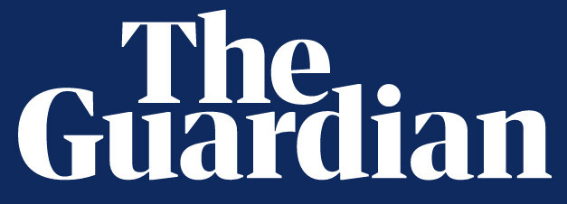
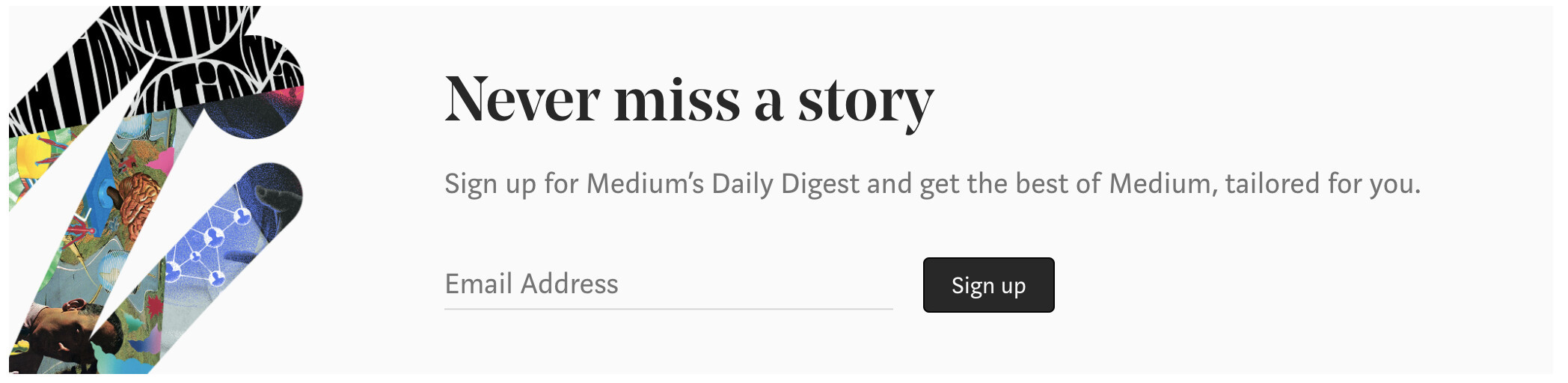
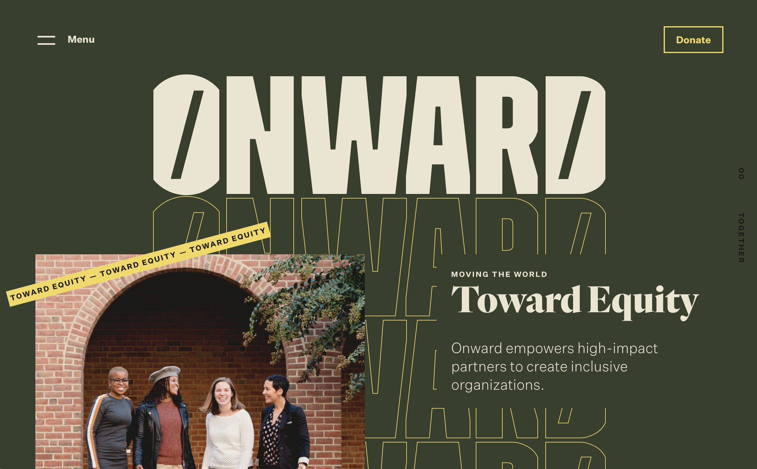
Anyway: specifically, I'm talking about the trend of big chunky, angular Didone-ish fonts used as headlines. Don't get me wrong: we're not totally out of the geometric woods yet, especially as Google doubles down on its Google Sans fonts. But these new pointy serif fonts, so long relegated to editorial-type publications like The Guardian and Medium, are now showing up elsewhere:

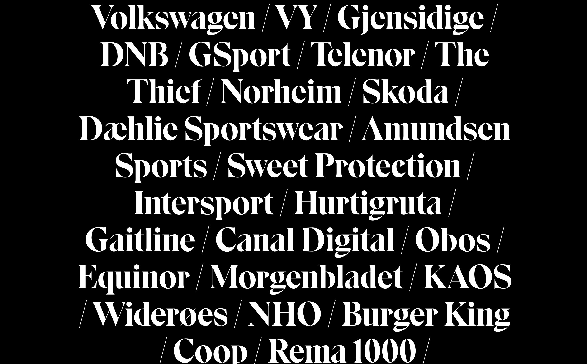
And now that it's 2020 and we've collectively woken from the grand serif dream, we're all doing it:
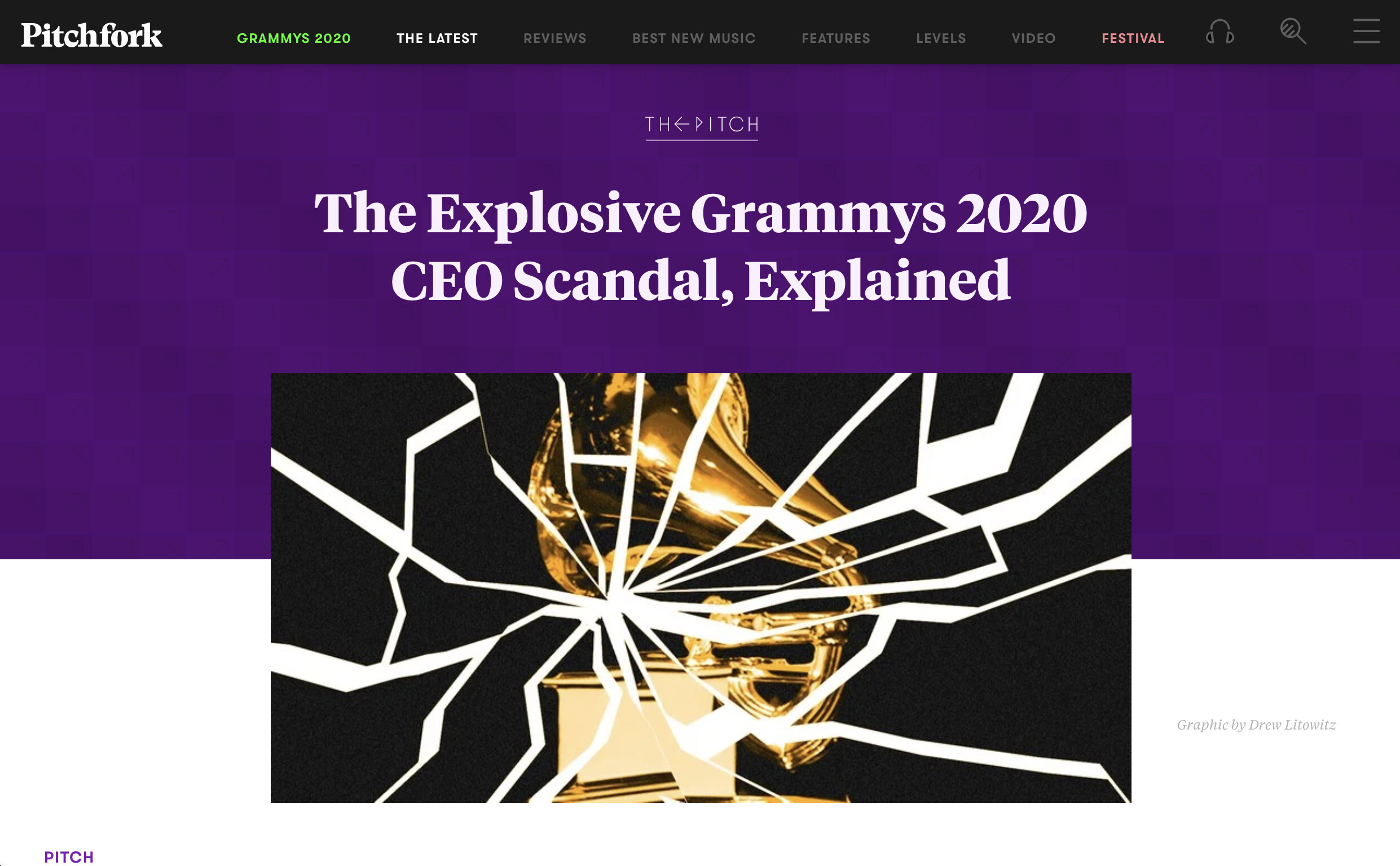
Even good ol Pitchfork, ever hip, has gotten in on the action (albeit subtly):
There's nothing wrong with all of this. I actually really like these fonts. Properly chosen and used in moderation, I think that they can add a sense of professional approachability to a brand. Something that says, I play by the rules, but we always have fun here, which is just the sort of milquetoast sense of humanness that a lot of brands need to survive in an ever-more-jaded marketplace. I think they pair really well with a social media account with a certain inoffensive sense of irreverence and a customer support team that act prompty on your requests and end every ticket response with:
Let me know if there's anything else I can help with!
I like these fonts. They might be my favourite design trend (that I've noticed) of the late 2010s/early 2020s so far. Expect to see them on my employer's site before long. I'll probably have been the one to put them there.
Next
I shaved my beard off and it made me all sorts of introspective for some reason.
Previous