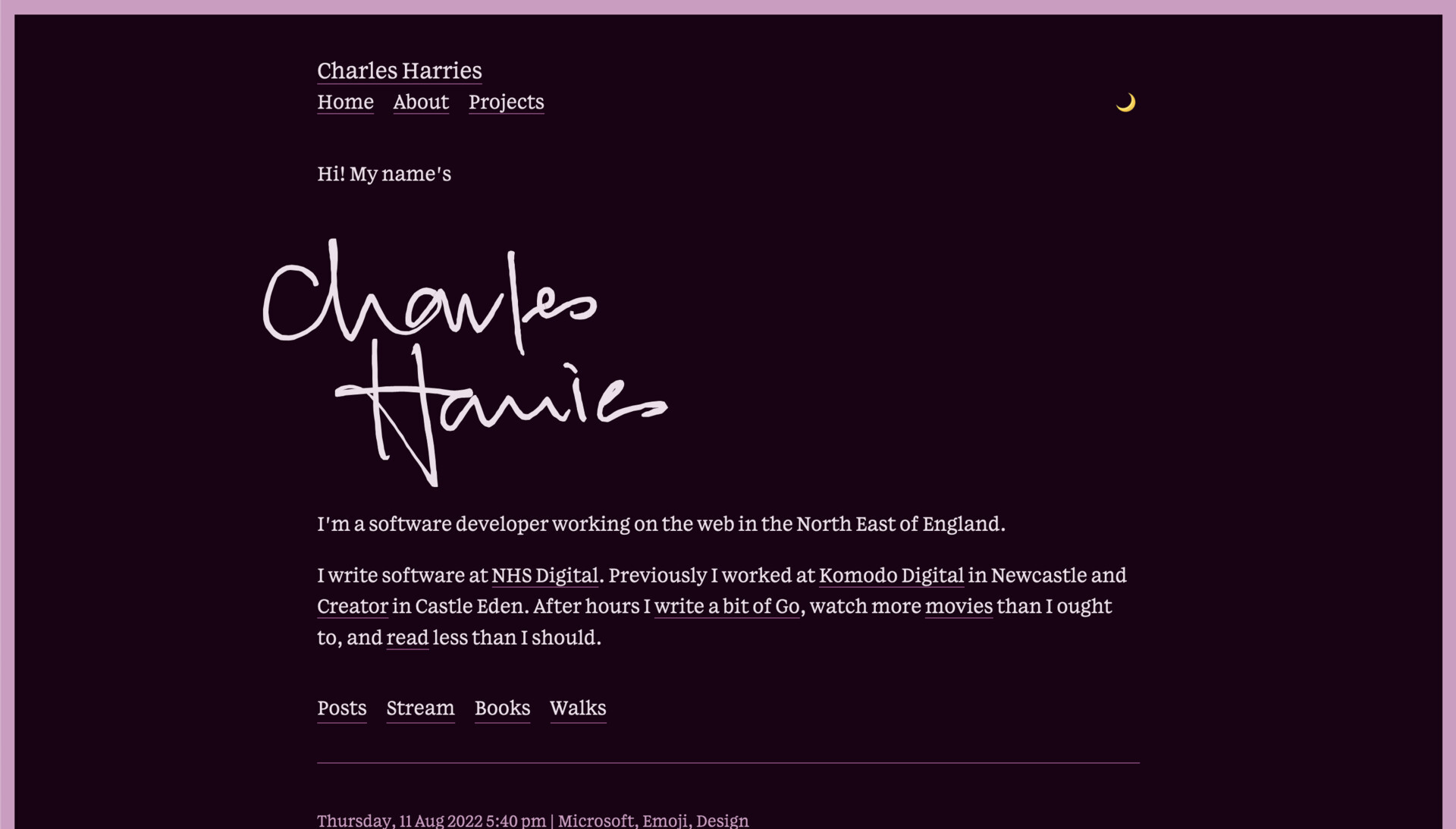
Blog v4
Long-time readers of the Charles Harries Variety Hour might have noticed that the website looks a little different. & look @ the sharp eye on you: it does!

I've tidied things up by removing the Next.js application that used to sit in front of the CraftCMS API that powered my website; having two separate applications to manage felt like overkill for what is, effectively, an extremely simple blog. Now, the whole thing is rendered by CraftCMS, effectively cached, & run through Cloudflare for good measure. In testing, there's not much of a difference performance-wise; in fact, I'm shipping a lot less JavaScript now. I've got a couple of comments on it, design-wise, that'll go in its own post; but for the minute I just wanted to mark the moment.
Hopefully everything's more or less where you expected it. And check out that font while you're at it: that's Hex's Lupino Serif, and it's a hell of a beautiful typeface. That high x-height, those narrow letterforms!

Next
I hinted at a fun way to use the CSS hsl() colour function in a recent post. Now you can see what I mean, in action!
Previous
Microsoft outdid themselves with their fluent emoji, and now that they've open sourced them, they've outdid themselves again.