Converging on peak gradient
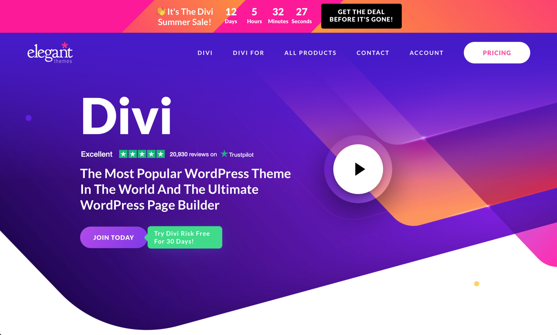
Design last reached a sort of local maximum for homogeneity back in 2017 or so: lots of fully-rounded buttons, subtle gradients, massive UI elements, hero images. At that point, these sorts of designs had permeated the Collective Agency Conciousness sufficiently that WordPress themes, like Divi had caught up (& in Divi's case, continued to ride the wave directly into 2022).
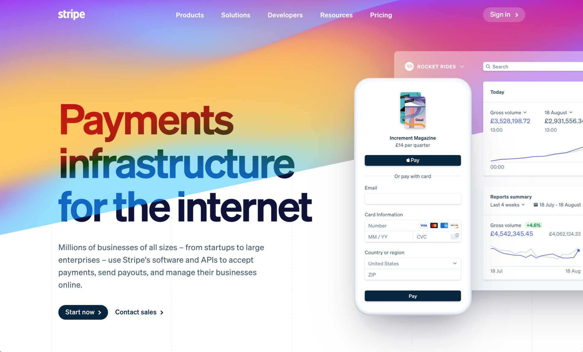
However, it feels like we're sort of approaching another local maximum, defined by more balanced layouts, blurred gradient blobs in the background, and Inter Everywhere. It feels a little bit like the Tailwindification of the web, which, behind the scenes, it probably is.
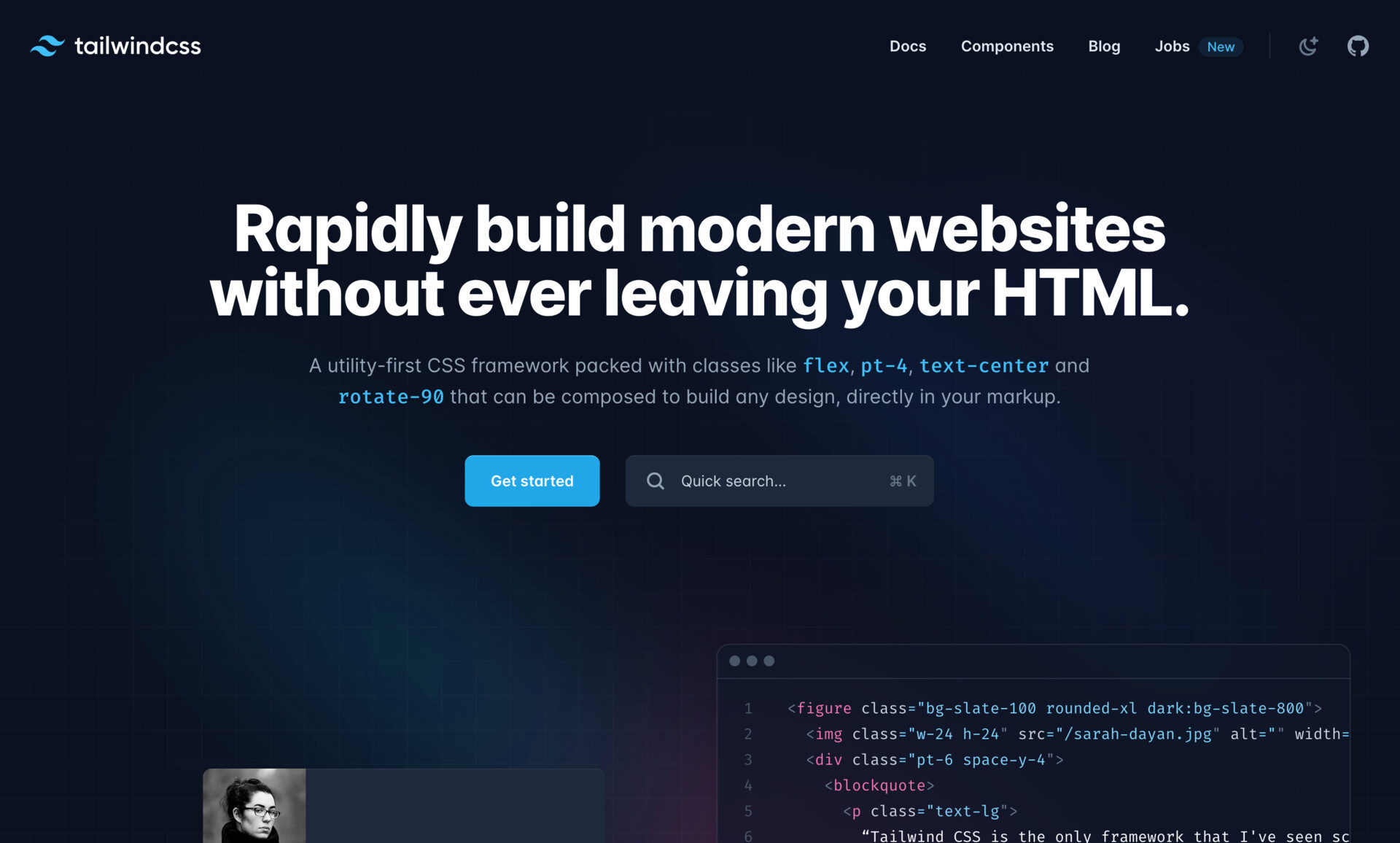
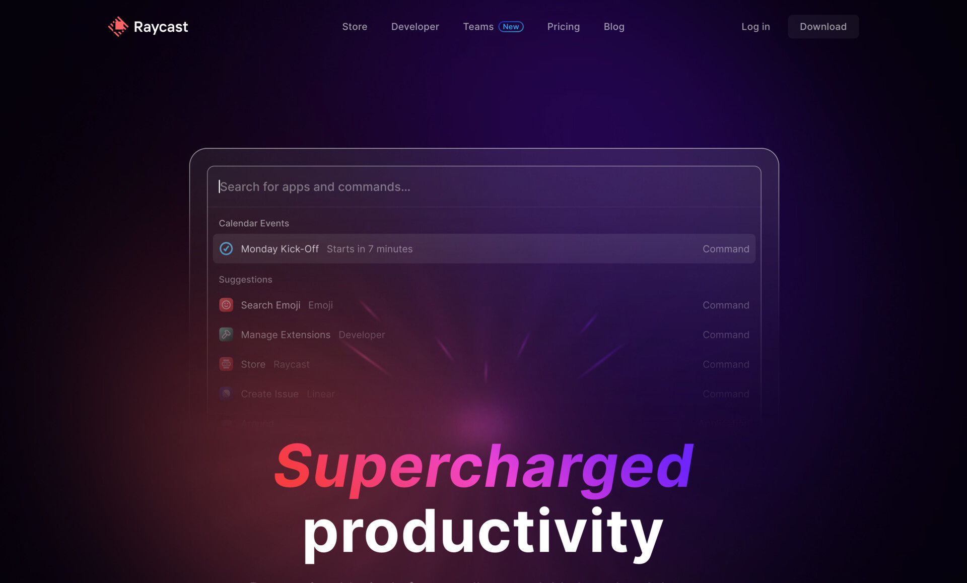
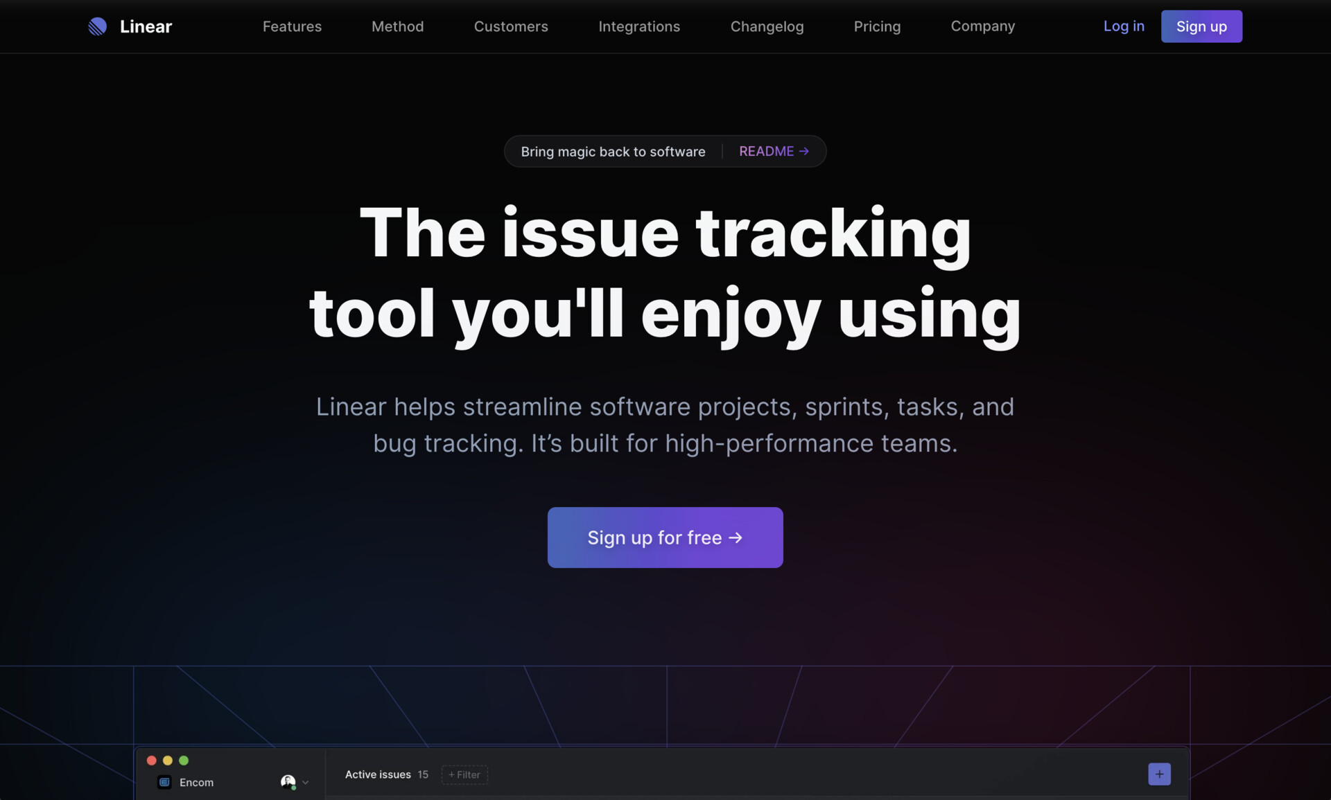
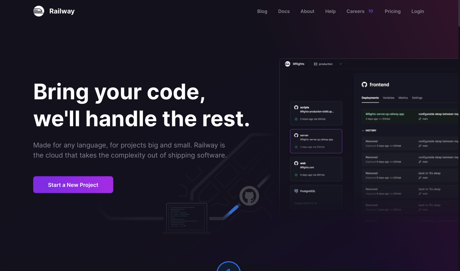
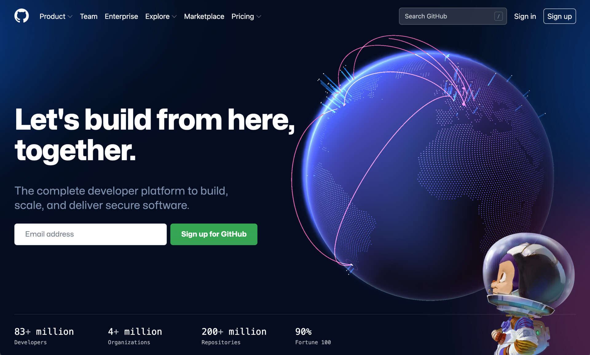
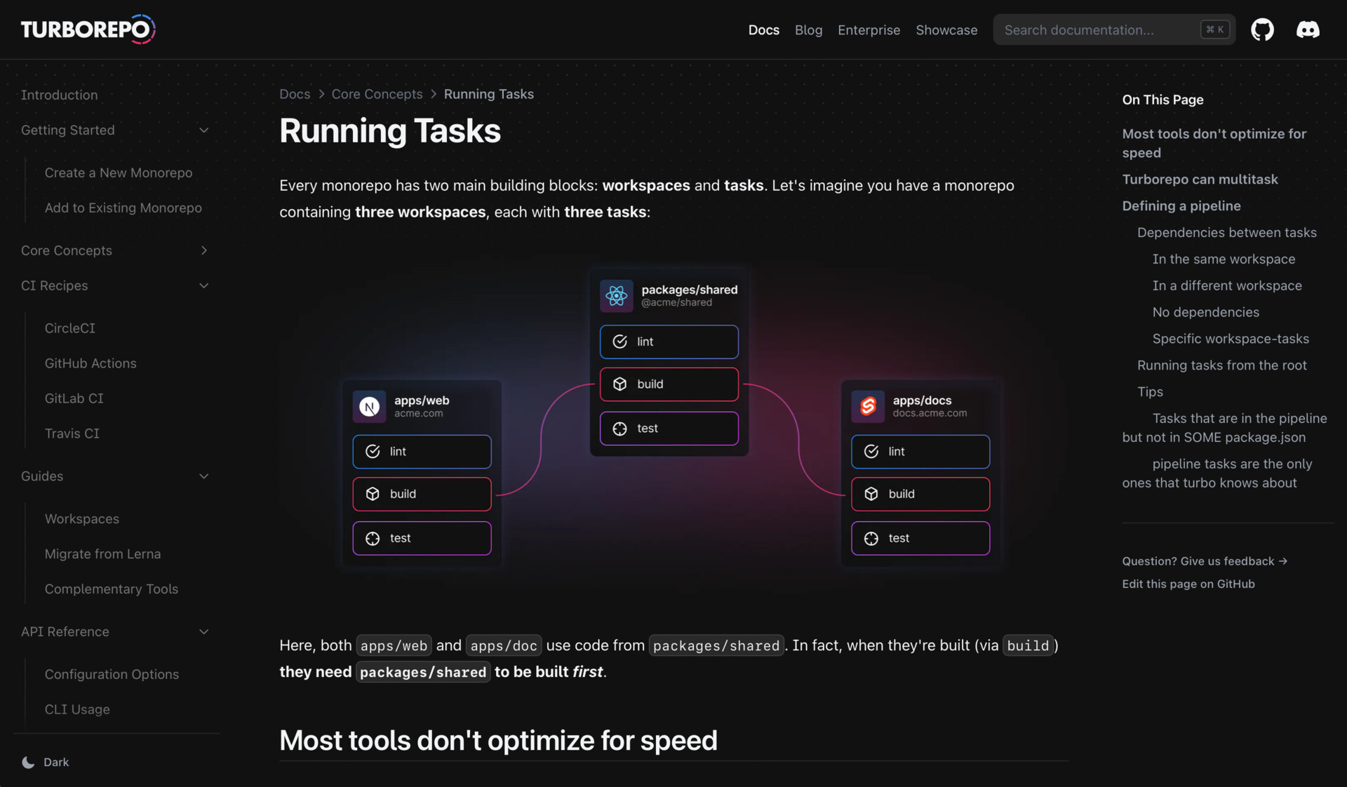
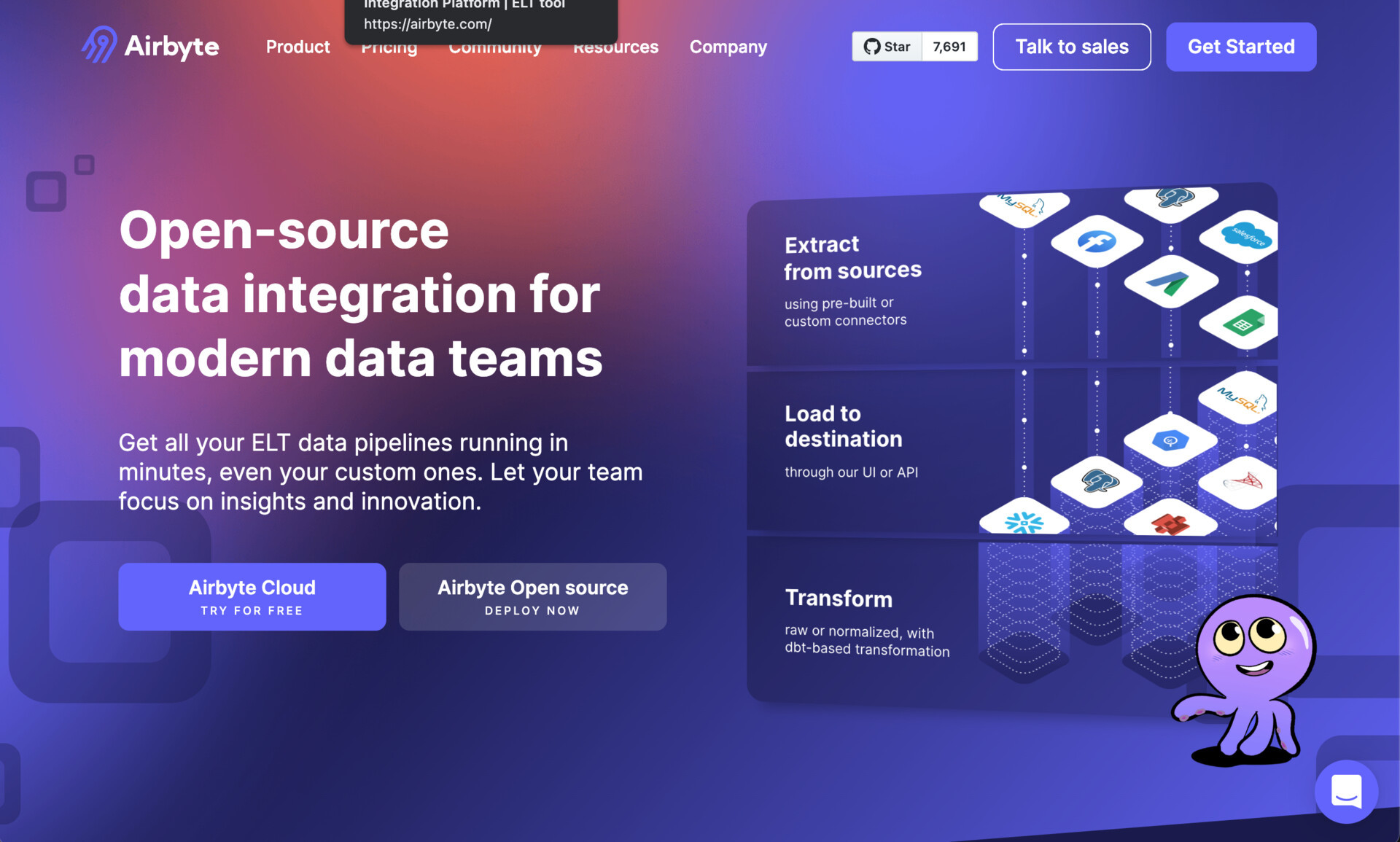
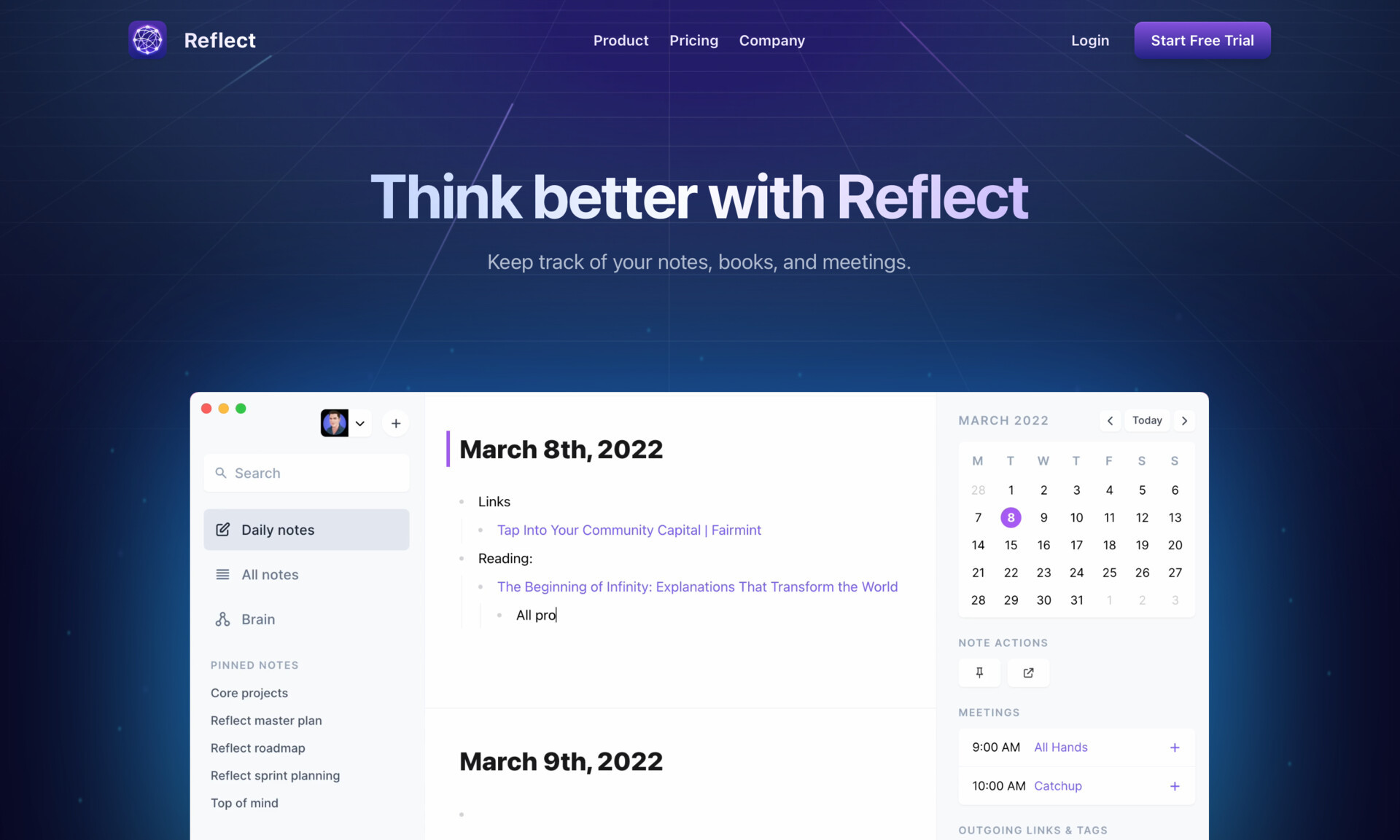
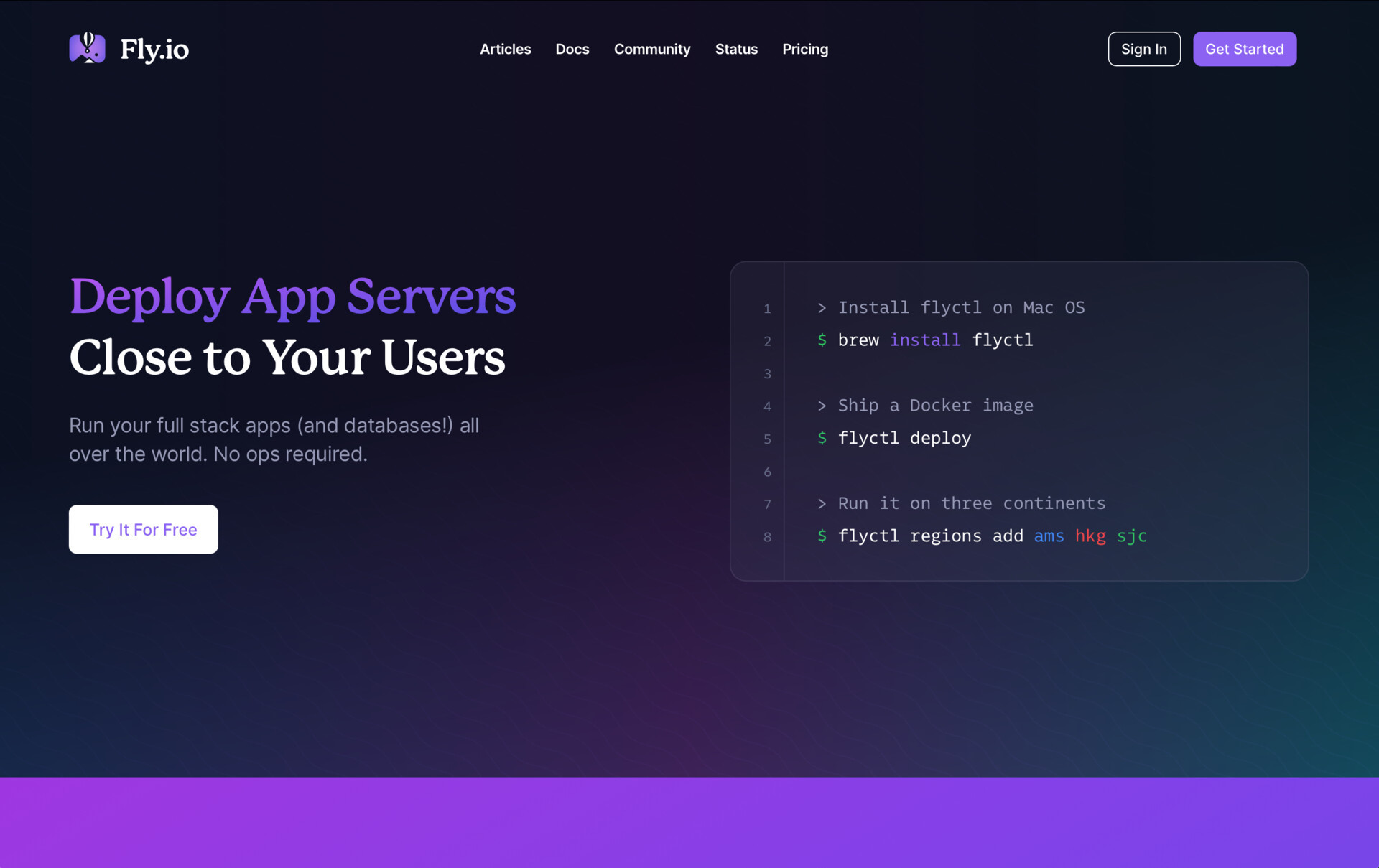
It comes in light mode flavour as well, probably most famously done by Stripe:
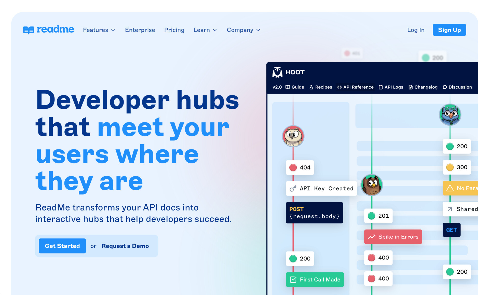
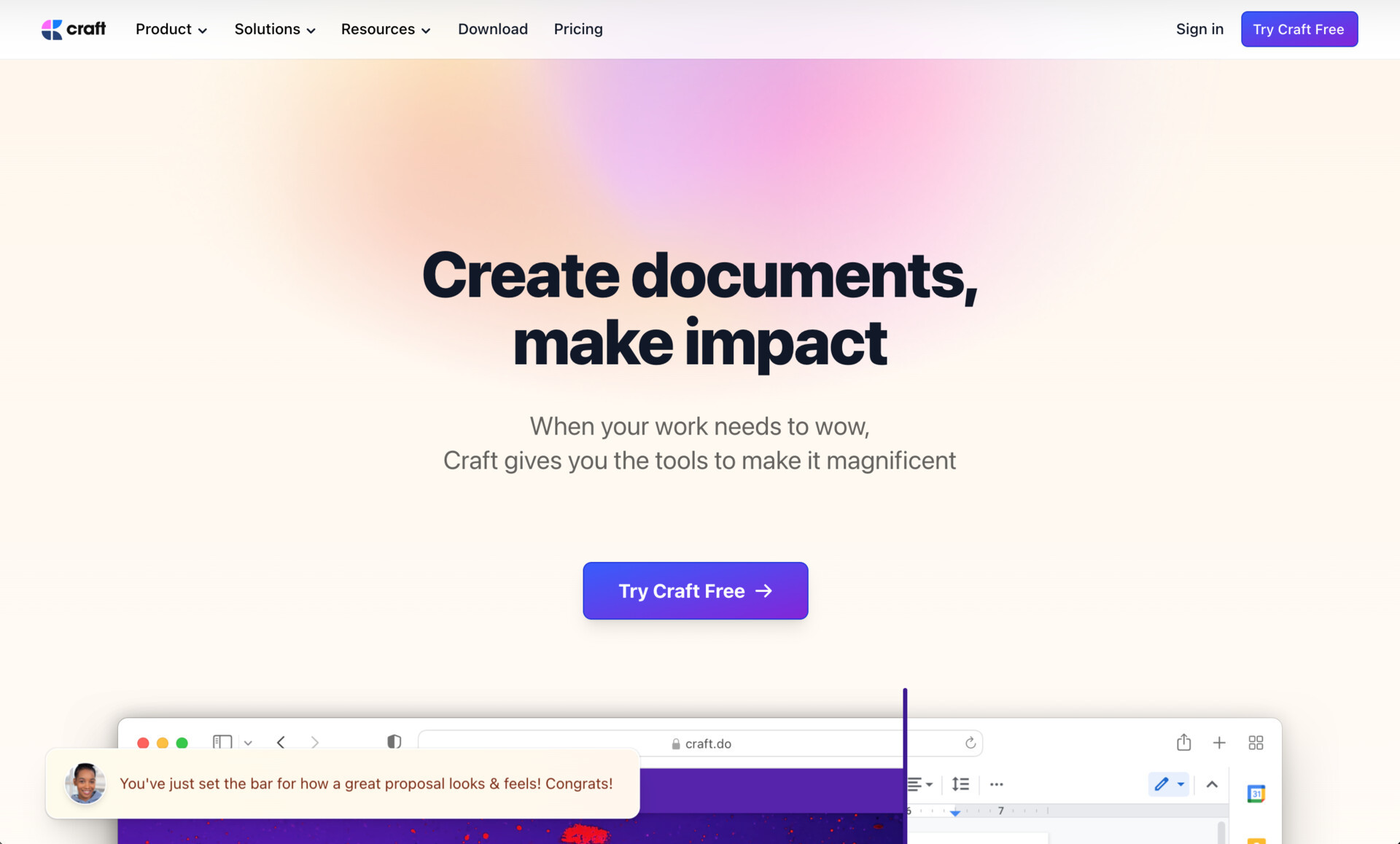
This isn't a new observation—here's Chris Coyier commenting on the Tailwindification of web design back in 2020—it just feels like the wave is about to crest and break.
Next
Social media sucks. Yeah that's right Twitter, I'm talking to you.
Previous
I haven't slept more than 4 consecutive hours over the course of the past couple weeks, and the results are: not catastrophic.