Fujichia

Finally, a website that actually defies explanation! Finally some good fucking internet.
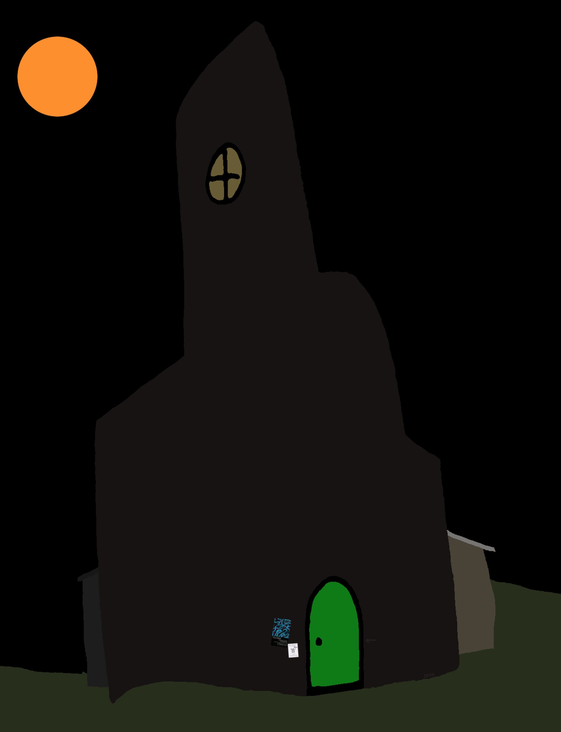
Fujichia is ostensibly the website for a "record label for CD-Rs and tapes"-slash-blog, but which in latter years has metamorphosed into a "castle full of enchantments, a warehouse of material related to previous projects, a blog, and occasionally a storefront."
These descriptions of website-as-place are not accidental: eschewing the traditional structure of scroll-down-to-view-more-words, Fujichia actually structures the website as a 2(.5?)-dimensional-ish space that you have to scroll and click around to explore. Links don't direct you to other pages, but to other parts of the castle; featured works are presented as installations in the grand ballroom. "Take the door below to the stairs, then go up a flight and it's the first door", the site reads. Direct hyperlinks are far between: you really do have to click through doorways and scroll around in space to find what you're looking for.
I don't know how to explain this to you. I'm just scrolling around in my browser, but the effect really is of being in a different place. The artwork is powerfully 2d, charming in its simplicity—all MS Paint-type work here, no ostentations WebGL to spin up my CPU and burn my lap. I've been clicking around for 20 minutes and I'm still finding new stuff. I feel like I'm at a National Trust house! Why have we been futzing around with dashboards and blogs and plaintext when the internet can be a real place you go and visit?
Next
Dropping CI/CD with GitHub Actions and going back to deploying my website by hand. It's artisan!