MDN redesign
Mozilla’s branding can be sort of schizoid a lot of the time, but one of the elements that ties a lot of it together (besides the neon colours) is their excellent ZIlla Slab font. It’s the official brand typeface—in fact, it’s the typeface that the logotype is set in. And until recently, it was the heading typeface on the Mozilla Developer Network.
(Firefox uses Sharp Sans, which is nice but has the sort of circa-2017 geometric flair that you find on a lot of free WordPress themes that overuse Poppins.)
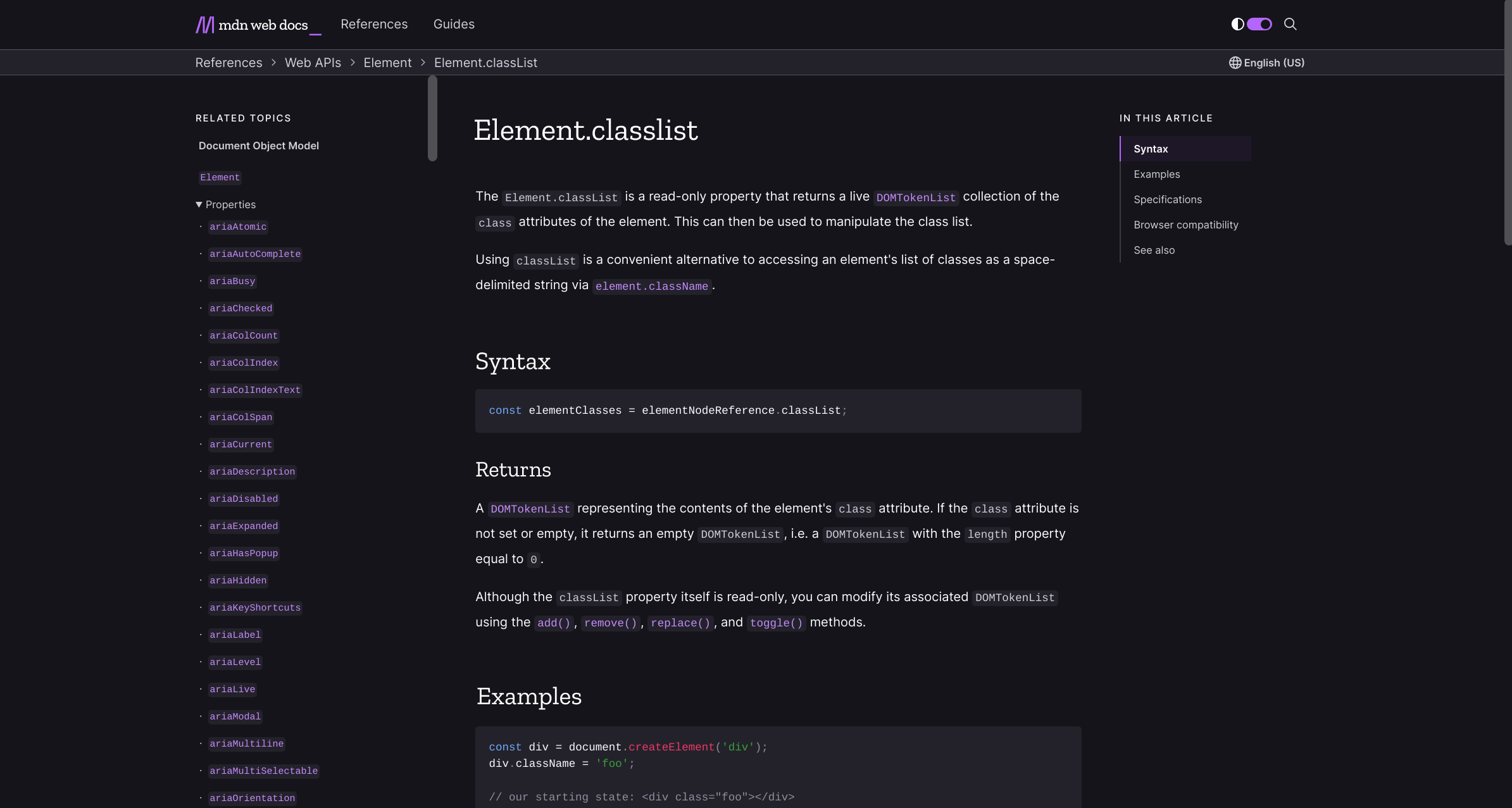
I quite like the new MDN site. It’s smart to associate the primary page colour with the site section you’re currently on; dark mode is a welcome addition; I love the sticky left-hand contents section. But it feels so bland now—specifically from a typeface perspective.
I was sort of disappointed to see Zilla replaced with Inter for headings. Inter is a great font—it gives off the sort of smart architectural feel of San Francisco across a lot more platforms. But it’s very much of the current moment, which means that it’s going to feel as dated as Poppins in like 3 years.
The choice of Inter for headings here feels reactionary. More than that, it feels confusing, since Zilla is shorthand for a trustworthy web platform docs site among a lot of devs. Inter (or some other generic sans-serif) is the standard for every other markdown-based statically generated docs sites.
I don’t think it was a design decision, either. The site looks great with Zilla employed for headings, and it retains its old recognisable character:
So like what gives?
Next
A nearly 40-kilometer walk across some of the best country in the Yorkshire Dales. If you've got the nerve and the knees for it, you'll be hard-pressed to find a better walk within like 50 miles.
Previous